Time for a new logo design. The new pc makes this one look particularly yucky-colored. The other thing is the widescreen leaves a lotta space either side of that carefully planned-out 800 pixel view. Does anybody need the 800 anymore? I mean like, wow, even I’m up to 1680 now. That’s over half a screen wasted.
Maybe I’ll have a movie clip as a logo. Naked men and women skipping across the banner holding the letters that spell out Spinning.
The guys will hold the S and the i’s. Tee-hee.
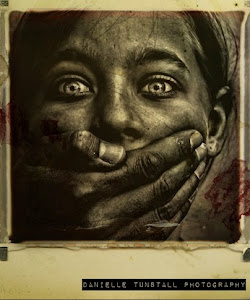 The Lost Children: A Charity Anthology
How did I miss this, Hee Hee.